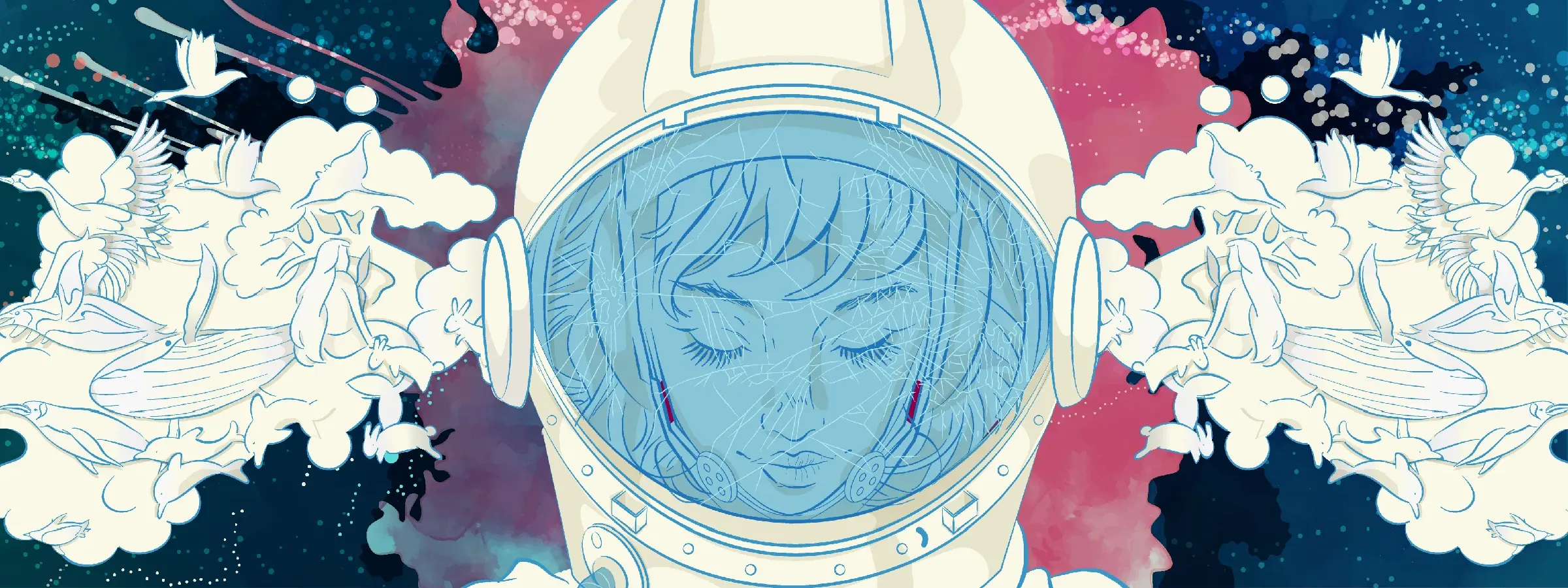
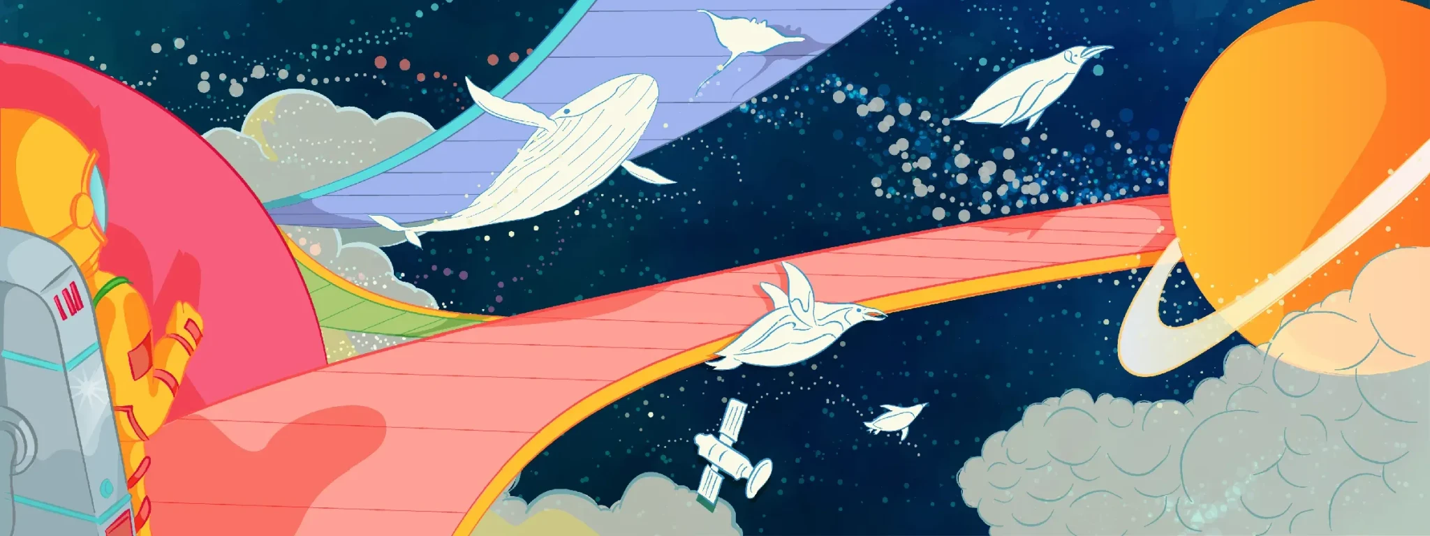
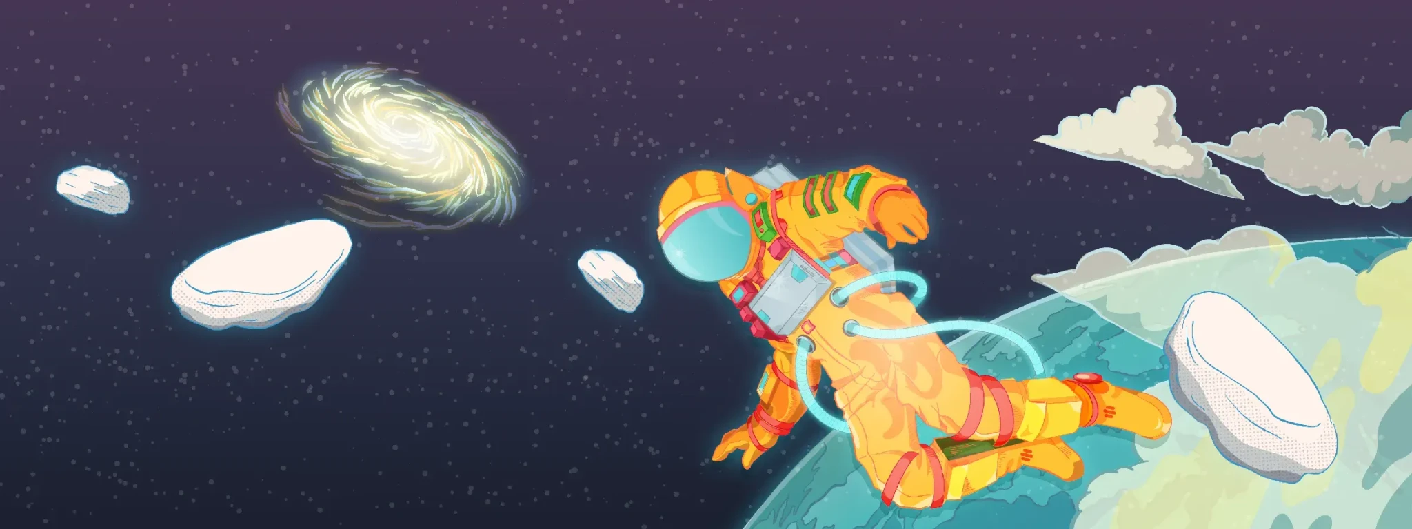
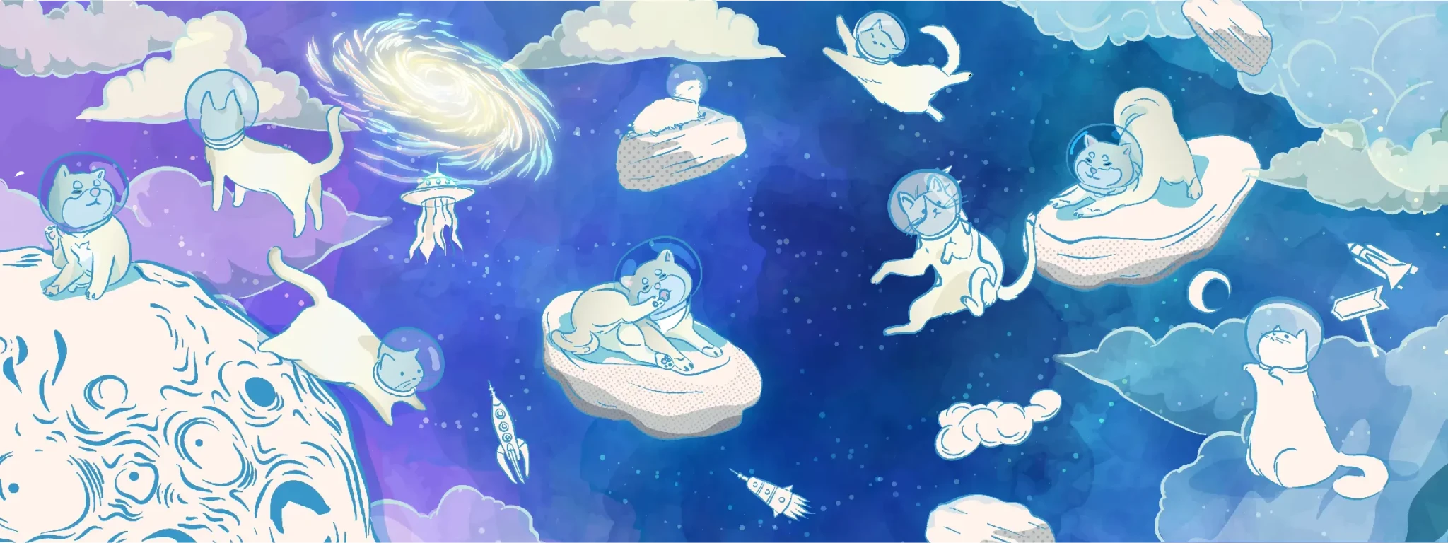
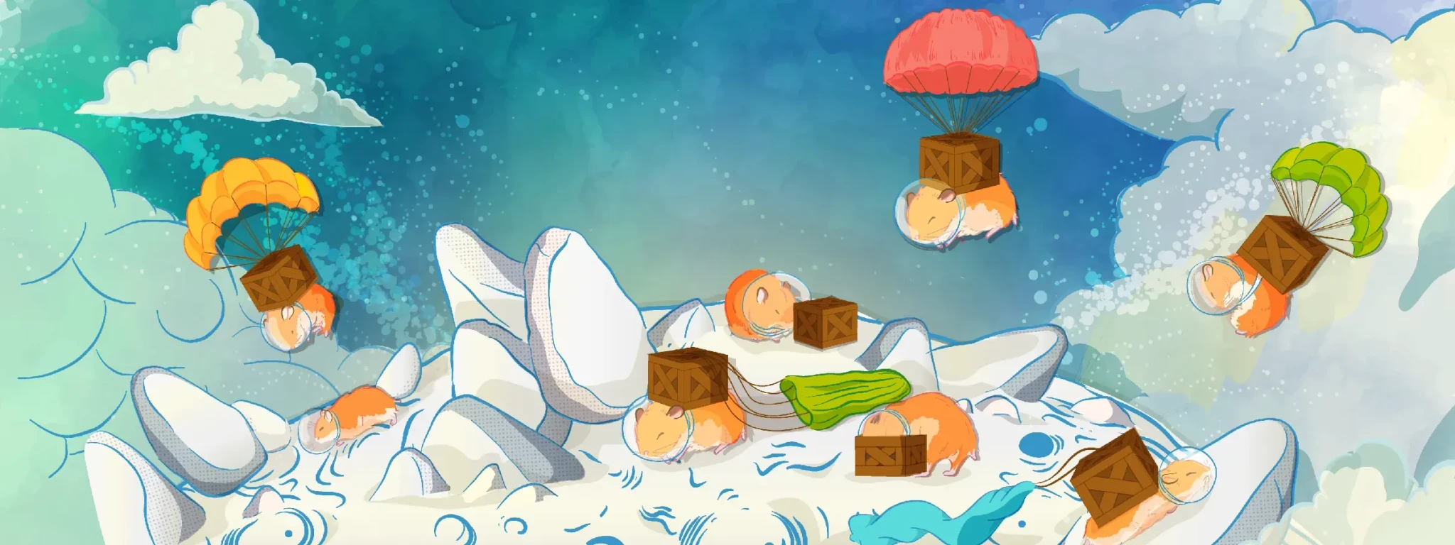
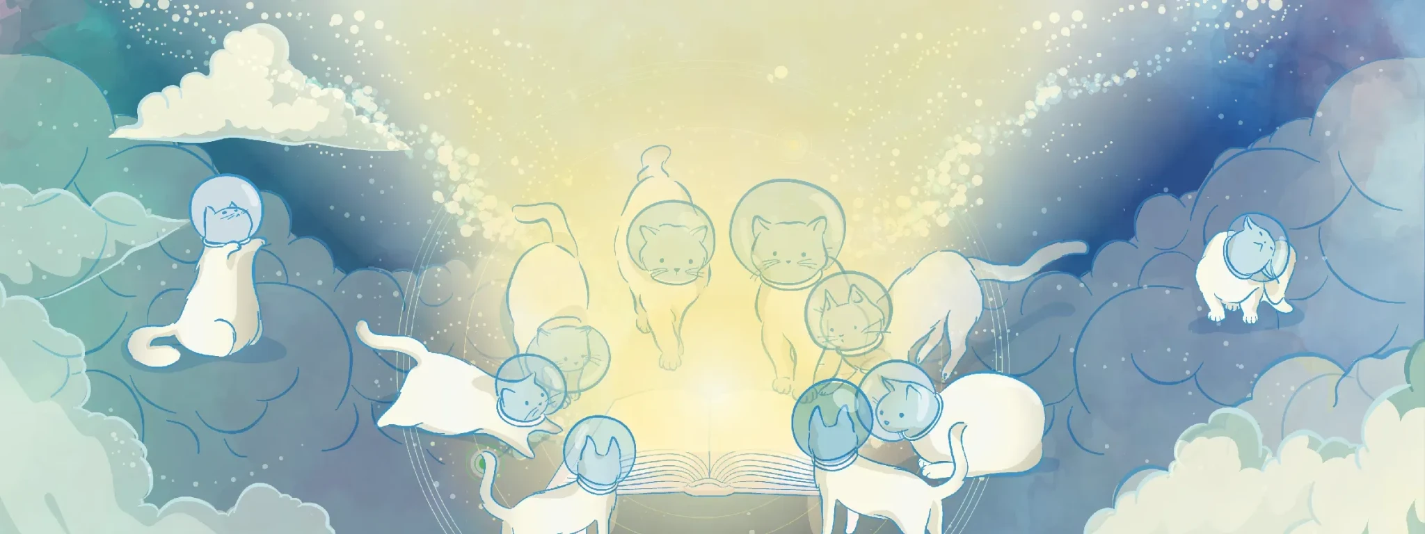


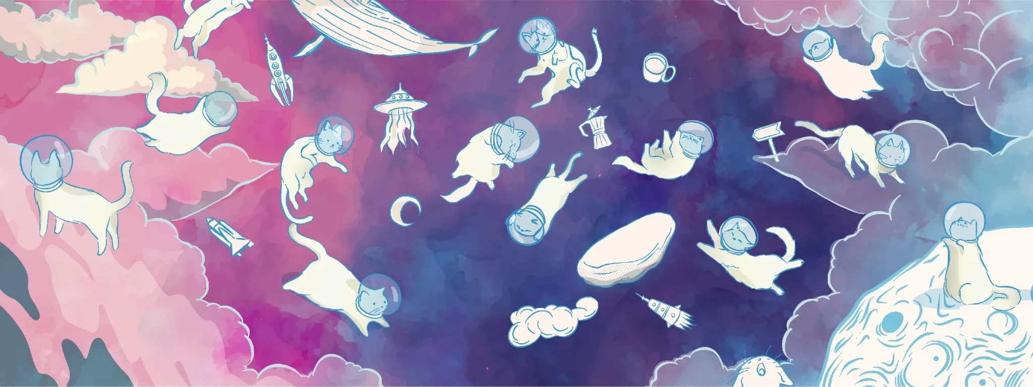
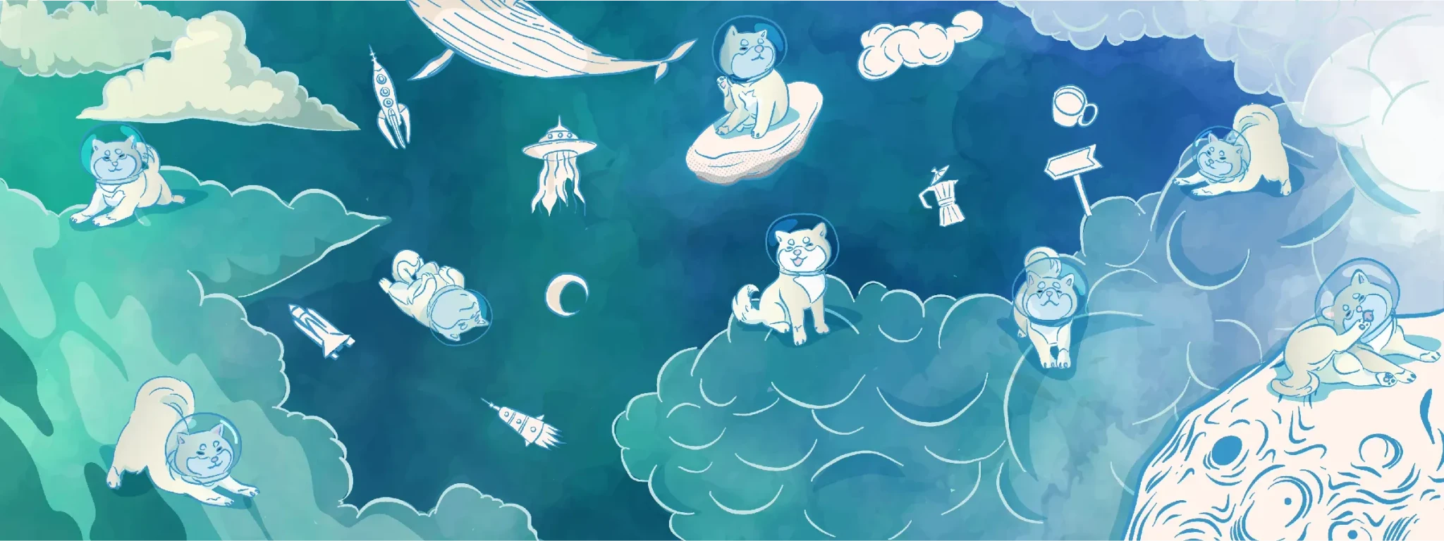
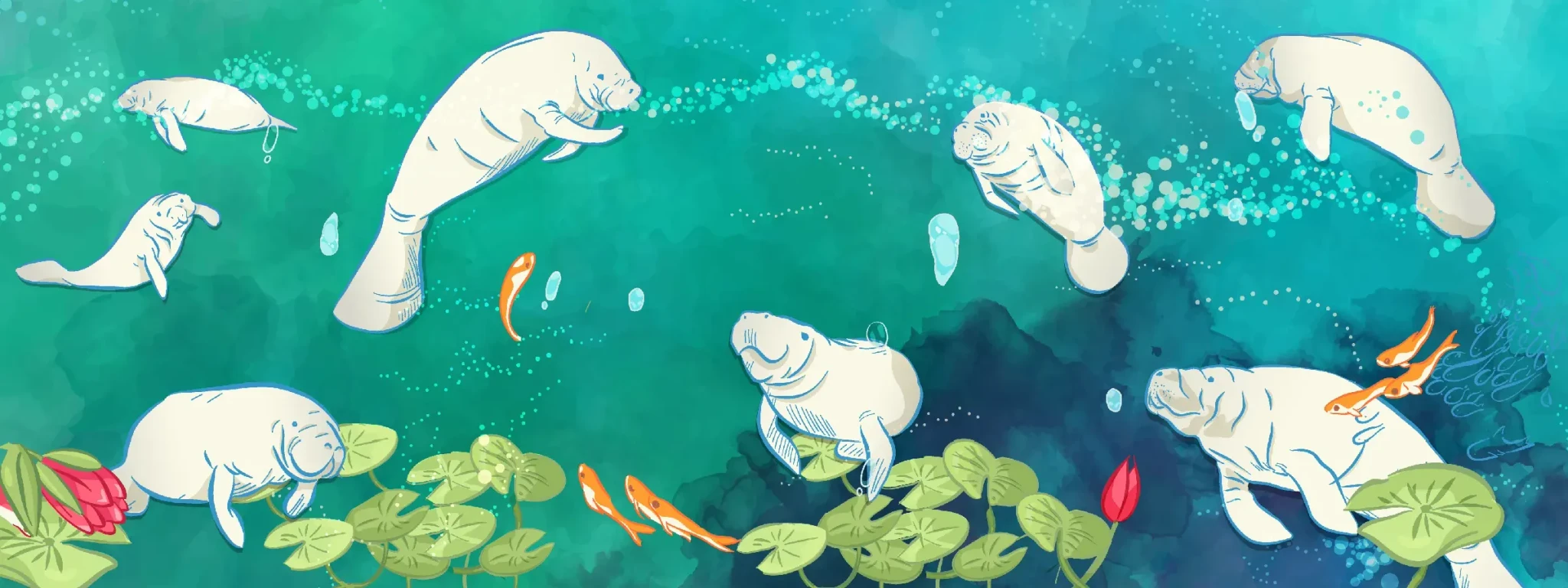
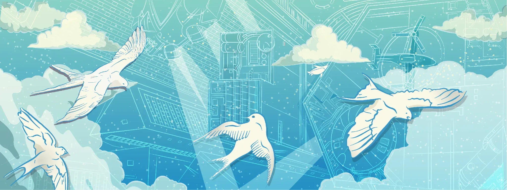
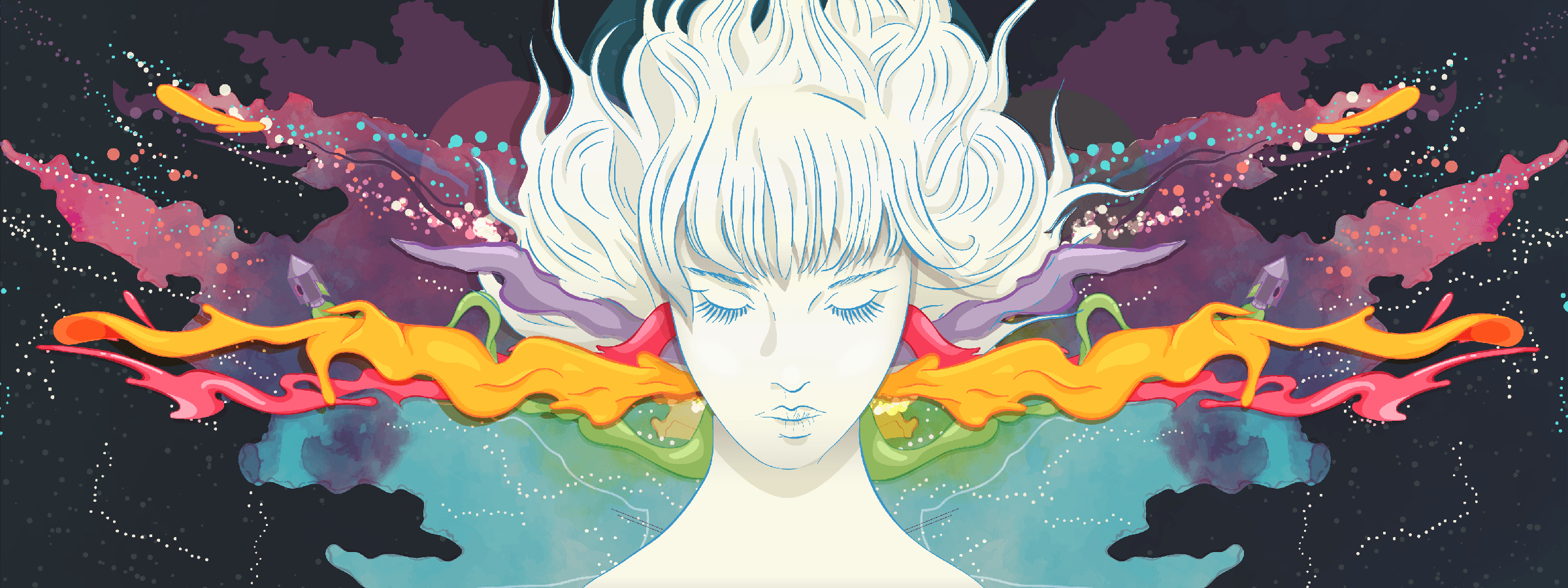


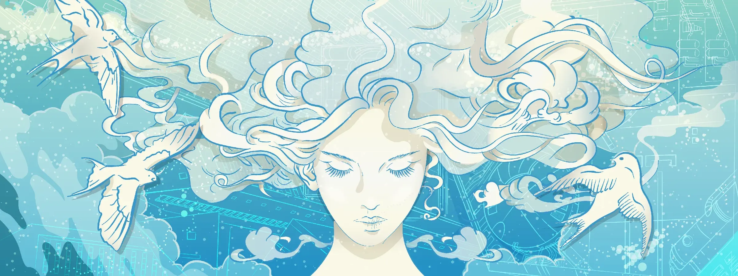
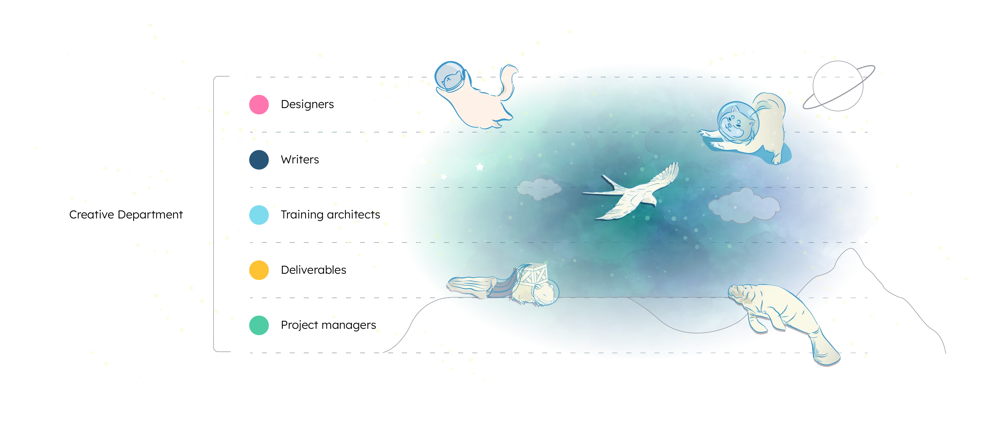
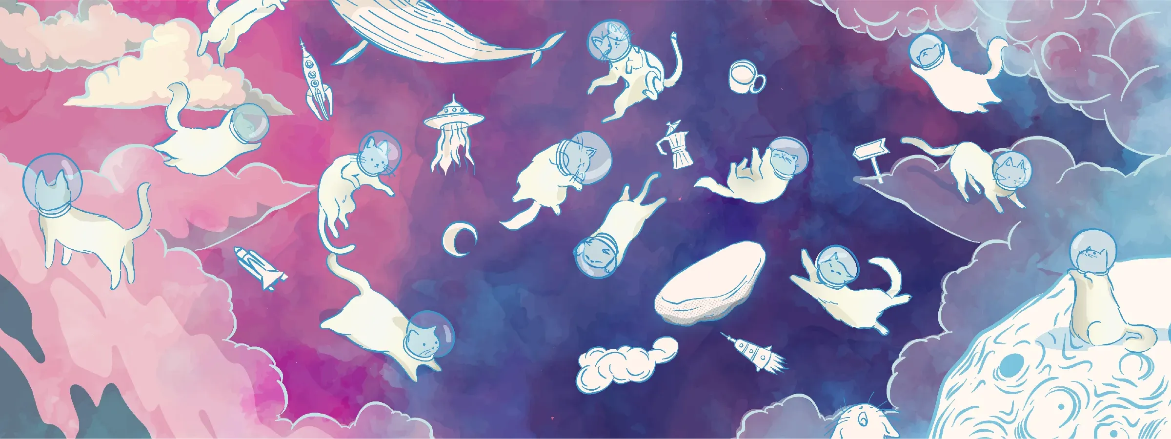
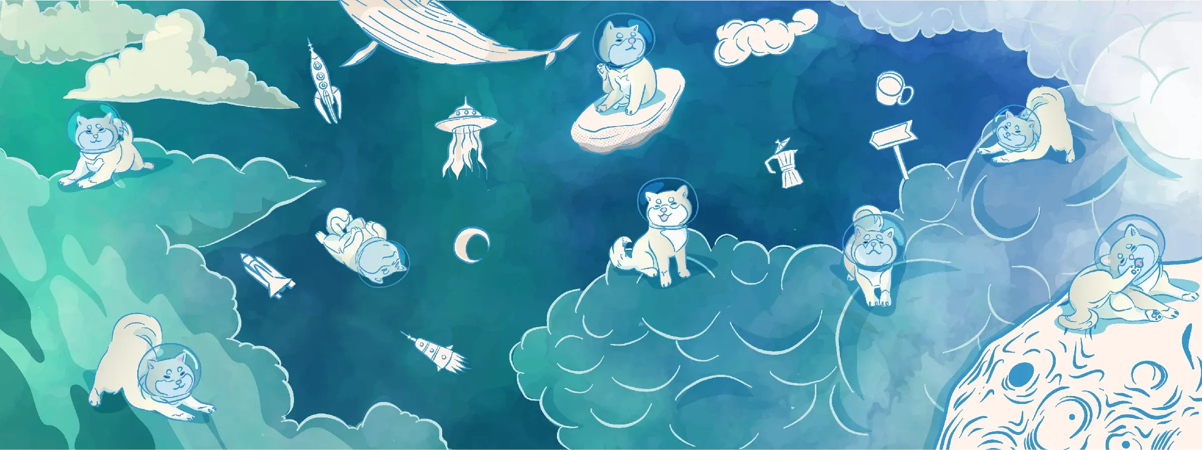
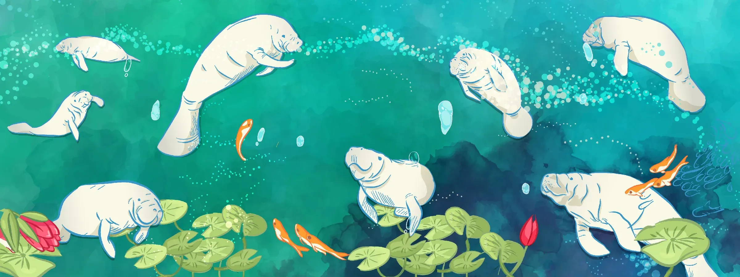
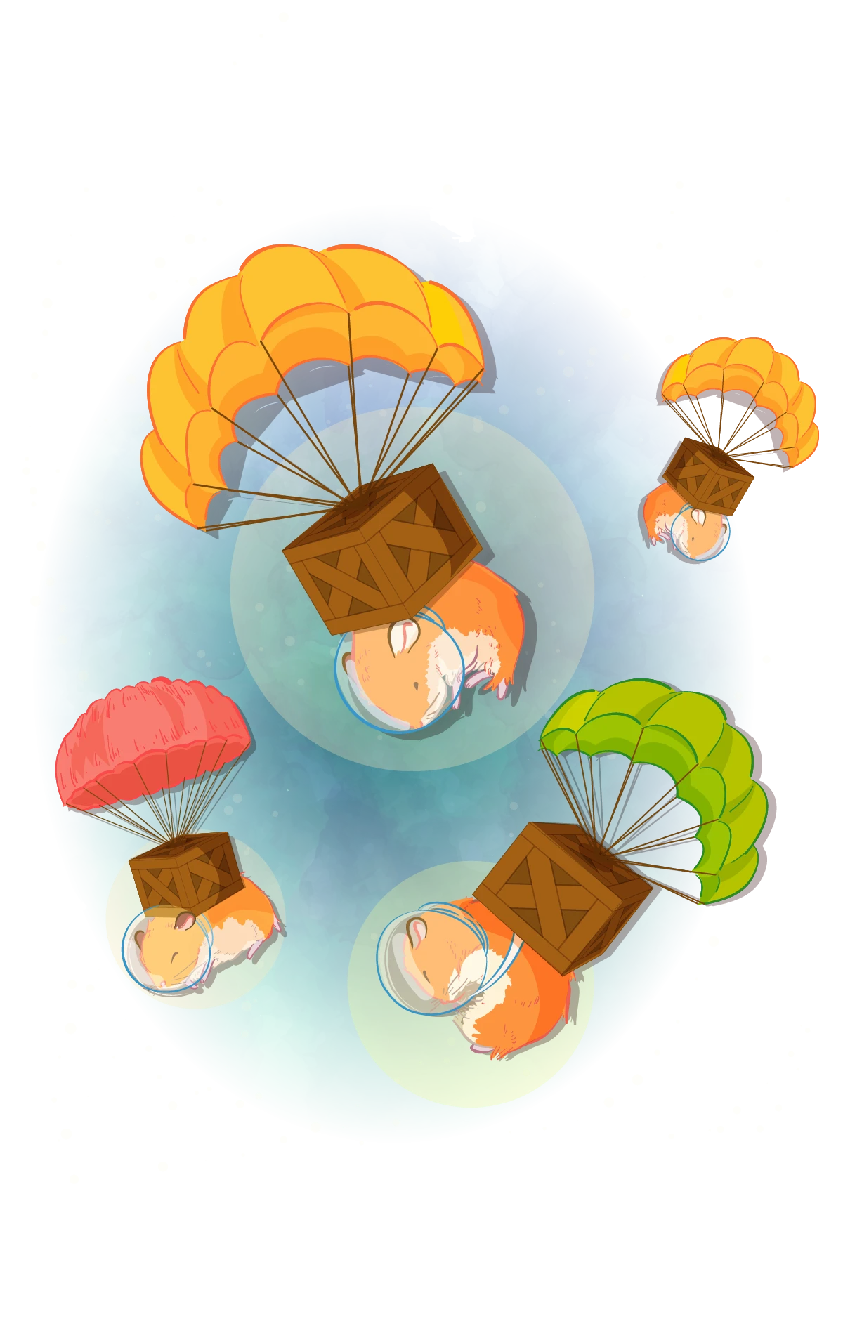
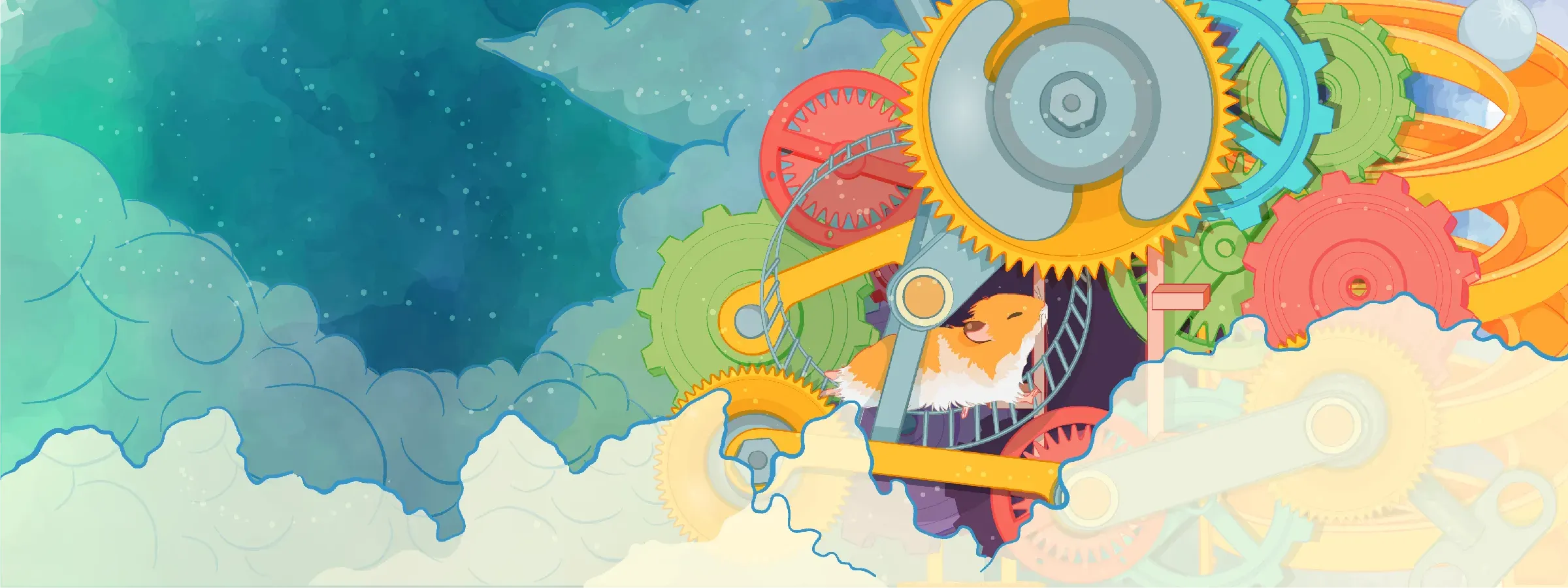
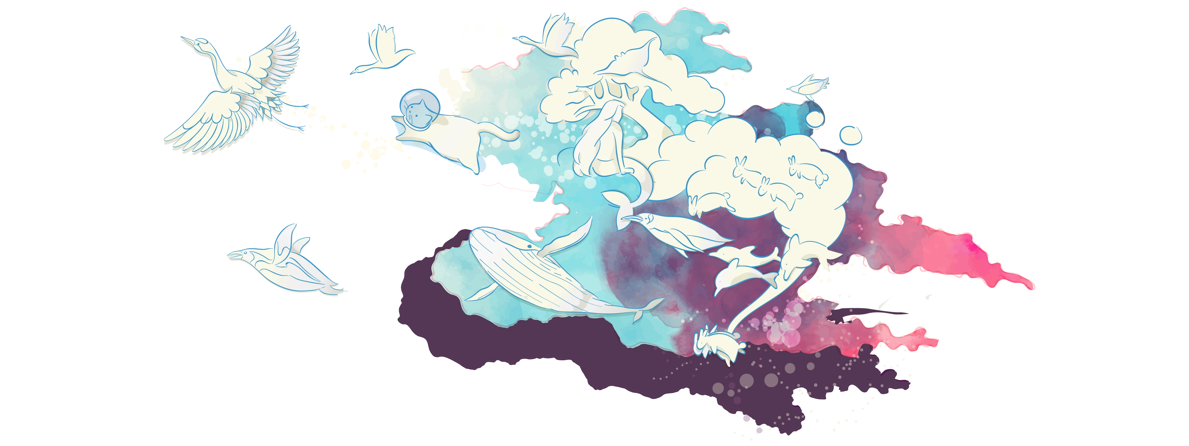
Each team was represented within its symbolic ecosystem, placing each department’s representative creature within a specific layer of the earth or atmosphere.

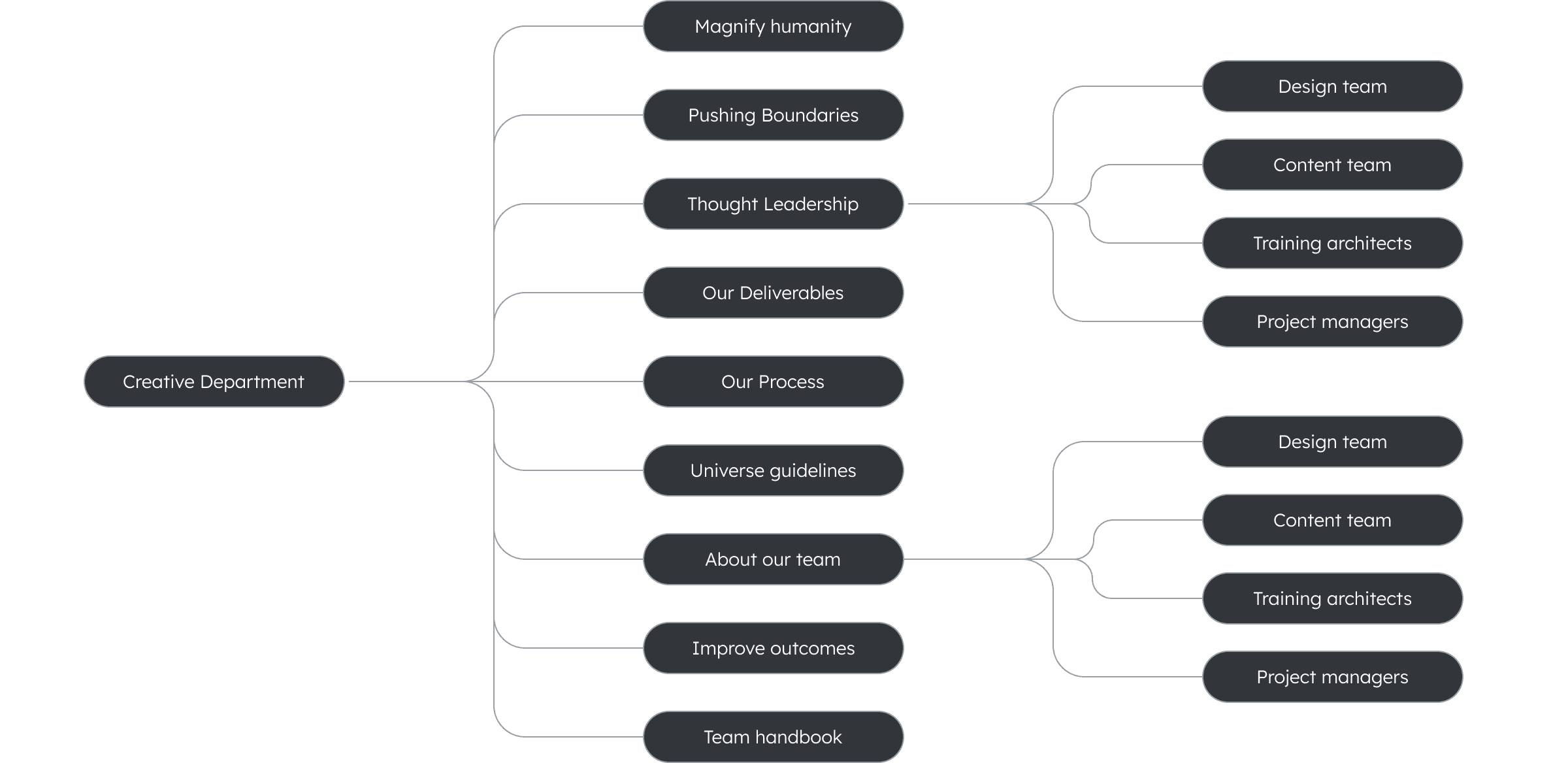
Overview of all intranet sections and pages.

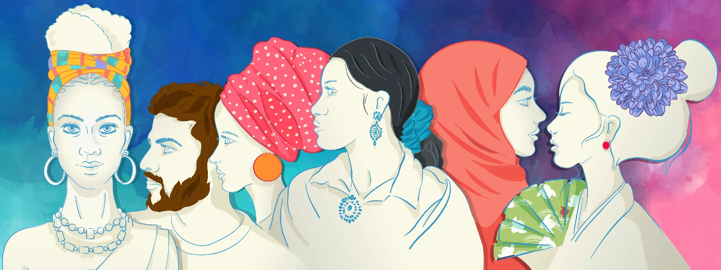
Main Palette (illustrations)
#FAF8E6
R 250 G 248 B 230
#3896C9
R 56 G 150 B 201z
#E6E3D8
R 230 G 227 B 216
#D6D6CB #FAF8F6 #F7F7F2
Supporting Palette
#F77E71
R 247 G 126 B 107
#5ADBDA
R 90 G 219 B 218
#FEC133
R 254 G 193 B 51
#543653
R 84 G 54 B 83
#A07FAC
R 160 G 127 B 172
#ACCA72
R 172 G 202 B 114
FEAB45
R 254 G 171 B 69
Team Backgrounds
#FF75AD
R 255 G 177 B 173
#255578
R 39 G 85 B 120
#80DCED
R 128 G 220 B 237
#4FCCA4
R 79 G 204 B 164
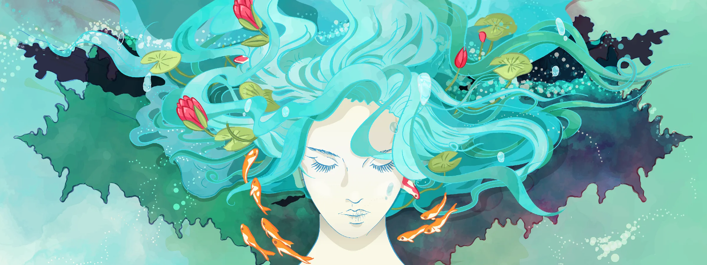
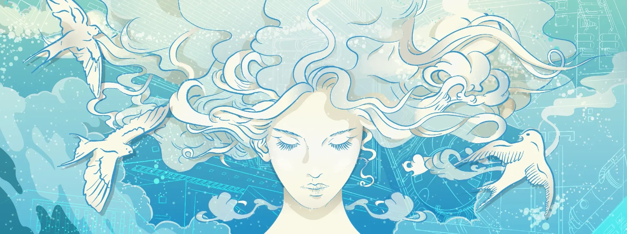
8:3 Hero banner
6:1 Landscape banner
4:3 Half page image
Banner Design and Responsive Specifications
Each banner was developed in three formats (landscape, square, and hero size) to ensure full responsiveness across screen sizes. Vector illustration allowed for flexible scaling and seamless integration with the intranet’s evolving layout.