
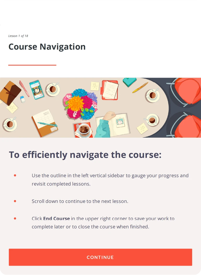
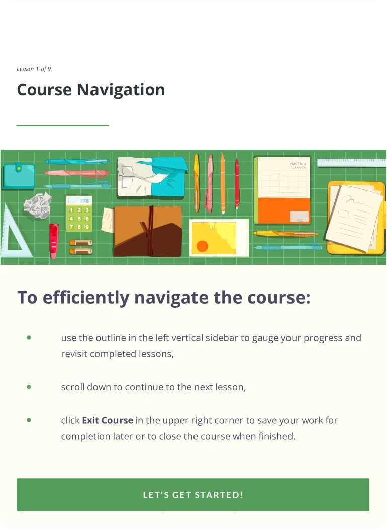
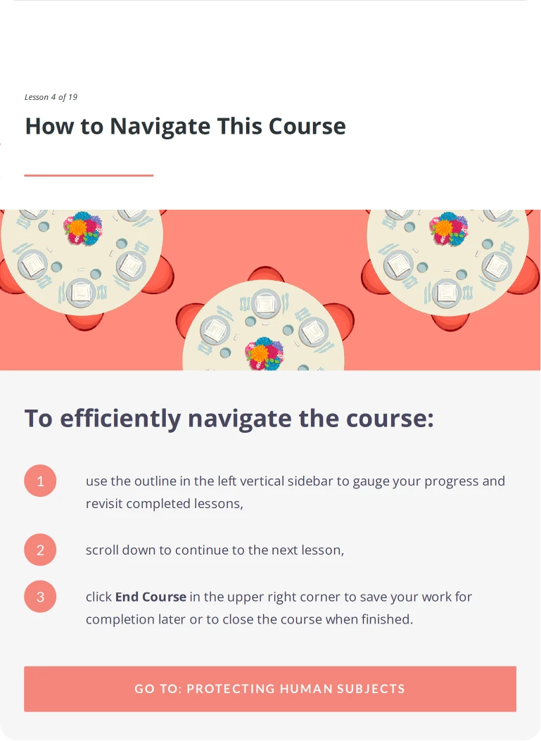
The IQVIA Good Clinical Practices (GCP) E-Learning Design System was developed to support nine interactive courses for IQVIA’s 87,000 employees across more than 100 countries. The initiative focused on transforming dense regulatory content into a compelling digital learning experience by establishing a scalable, reusable design system within a strict three-month deadline. Working collaboratively with internal stakeholders and the creative team, the visual direction and illustration guidelines not only brought consistency to the training program but also influenced IQVIA’s broader design language.
The IQVIA Good Clinical Practices (GCP) E-Learning Design System was developed to support nine interactive courses for IQVIA’s 87,000 employees across more than 100 countries. The initiative focused on transforming dense regulatory content into a compelling digital learning experience by establishing a scalable, reusable design system within a strict three-month deadline. Working collaboratively with internal stakeholders and the creative team, the visual direction and illustration guidelines not only brought consistency to the training program but also influenced IQVIA’s broader design language.


Objective
The primary goal was to raise awareness and understanding of Good Clinical Practices, ensuring that employees grasp the importance of these guidelines and can recall best practices through true-to-life scenarios.
Objective
The primary goal was to raise awareness and understanding of Good Clinical Practices, ensuring that employees grasp the importance of these guidelines and can recall best practices through true-to-life scenarios.
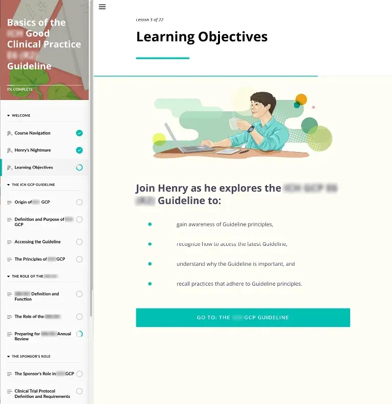
Course objectives screen from the GCP Fundamentals module.
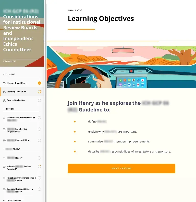
Course objectives screen from an advanced module in the training series.
Given the volume and complexity of the content, the project also focused on creating a scalable, visually engaging, and easily implementable design system that would ensure consistency across the entire training program.
Given the volume and complexity of the content, the project also focused on creating a scalable, visually engaging, and easily implementable design system that would ensure consistency across the entire training program.

Target Audience
The courses were created to engage a global workforce of 87,000 employees, including new hires and those with limited experience with good clinical practices. Designed as a self-paced learning experience, the courses provided new hires and employees handling sensitive information with a foundational understanding of GCP within their first six months.
What I did
Led the visual strategy and design system development to ensure a cohesive, scalable, and engaging e-learning experience. The work established the overall visual style for the product while also defining distinct visual universes tailored to each course, developed in close collaboration with other designers and contributors. Oversaw the work of illustrators and designers, defined the entire graphic system, ensured stylistic consistency, coordinated asset production timelines, and contributed main illustrations and style refinements across multiple courses.
Concept development + Visual strategy
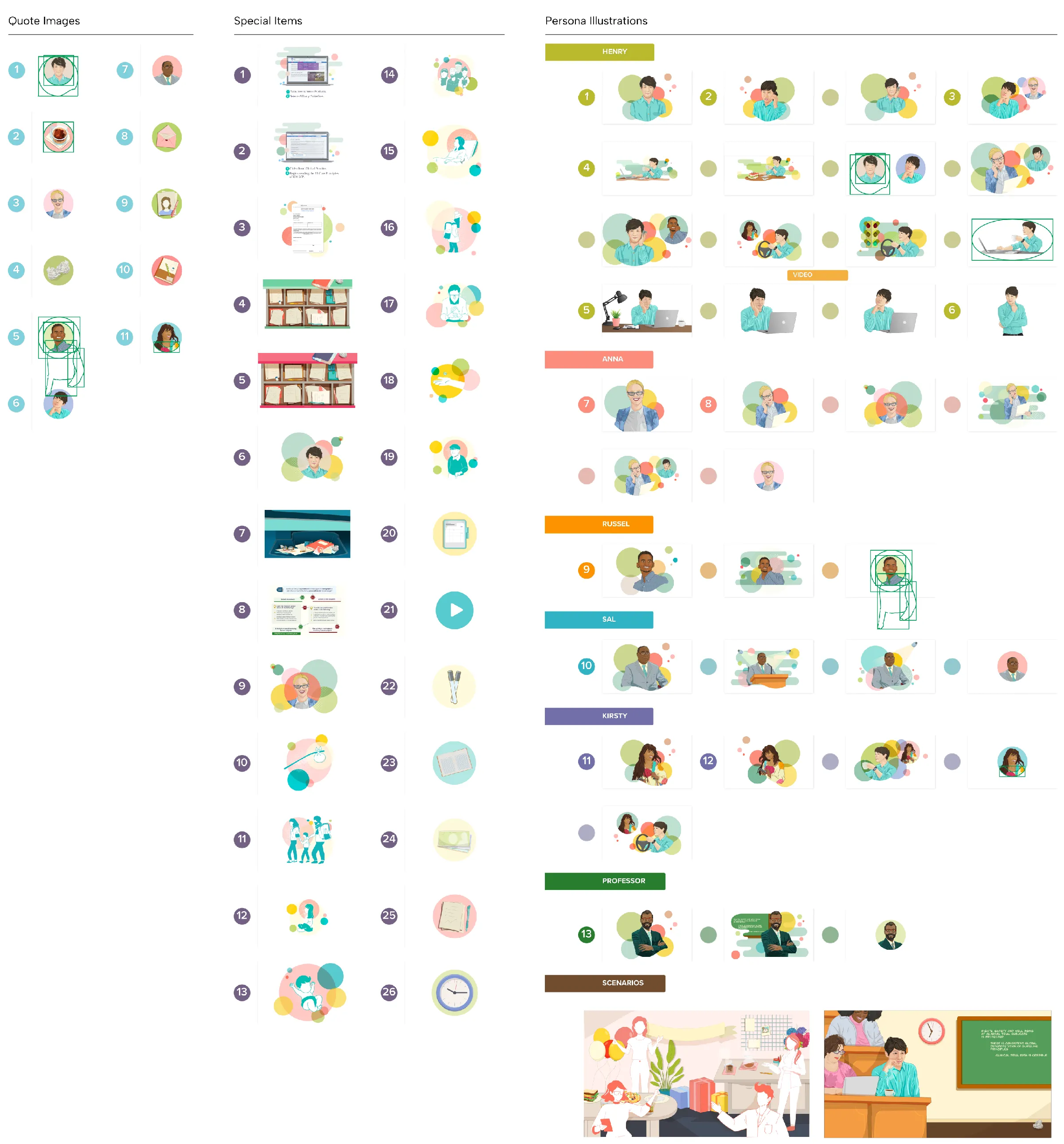
The courses feature recurring characters to anchor the narratives and create a relatable learning experience. Henry and Anna were personas created for this project. They appeared as protagonists mostly in all the trainings, along with other characters, which were previously made illustrations adapted to the project style.
Concept development + Visual strategy
The courses feature recurring characters to anchor the narratives and create a relatable learning experience. Henry and Anna were personas created for this project. They appeared as protagonists mostly in all the trainings, along with other characters, which were previously made illustrations adapted to the project style.

Persona 1: Henry (Japanese, 20s), a new employee navigating real-world GCP scenarios.

Persona 2: Anna (European, 30s), a seasoned mentor guiding Henry through key principles.
Persona 1: Henry (Japanese, 20s), a new employee navigating real-world GCP scenarios.
Persona 2: Anna (European, 30s), a seasoned mentor guiding Henry through key principles.


Additional supporting characters, adapted from existing persona libraries, appear throughout the courses to enrich the storytelling.

The other main characters
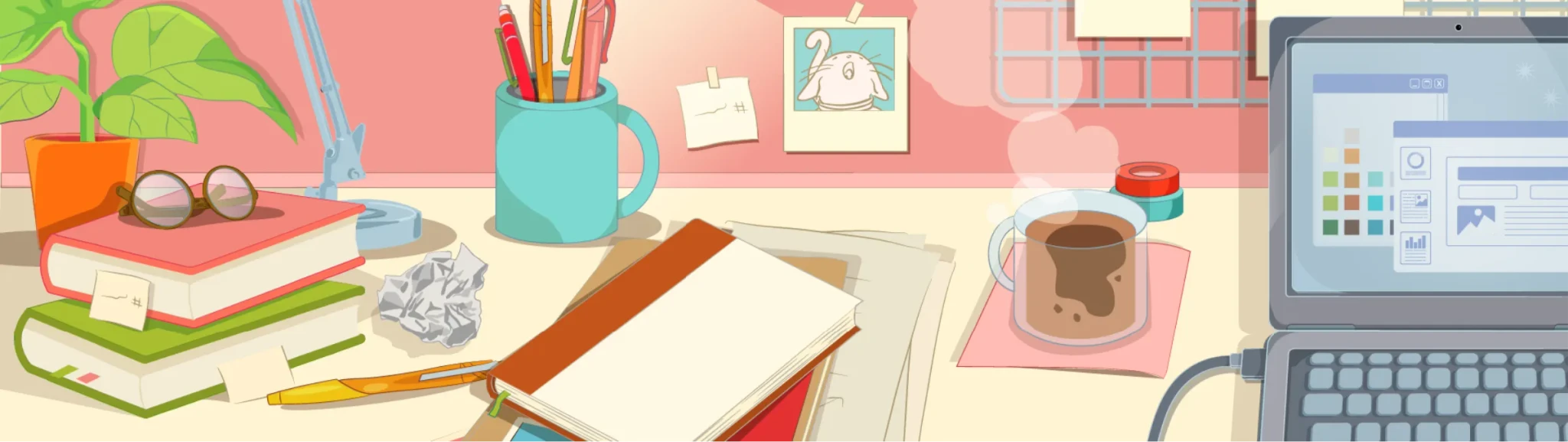
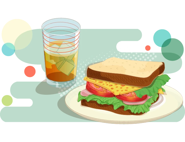
To make the dense, mandatory content more approachable, I used everyday office objects and stationery as narrative tools. These familiar elements helped create visual pauses between complex sections, reinforced the storytelling, and fostered a sense of intimacy without relying solely on characters. Combined with techniques like close-ups, organic shapes, warm colors, and transparency, this approach humanized the experience.
The other main characters
To make the dense, mandatory content more approachable, I used everyday office objects and stationery as narrative tools. These familiar elements helped create visual pauses between complex sections, reinforced the storytelling, and fostered a sense of intimacy without relying solely on characters. Combined with techniques like close-ups, organic shapes, warm colors, and transparency, this approach humanized the experience.

"While reading, Henry takes a pen and notebook from his desk drawer and begins summarizing the principles in his own words."
"While reading, Henry takes a pen and notebook from his desk drawer and begins summarizing the principles in his own words."
"While reading, Henry takes a pen and notebook from his desk drawer and begins summarizing..."

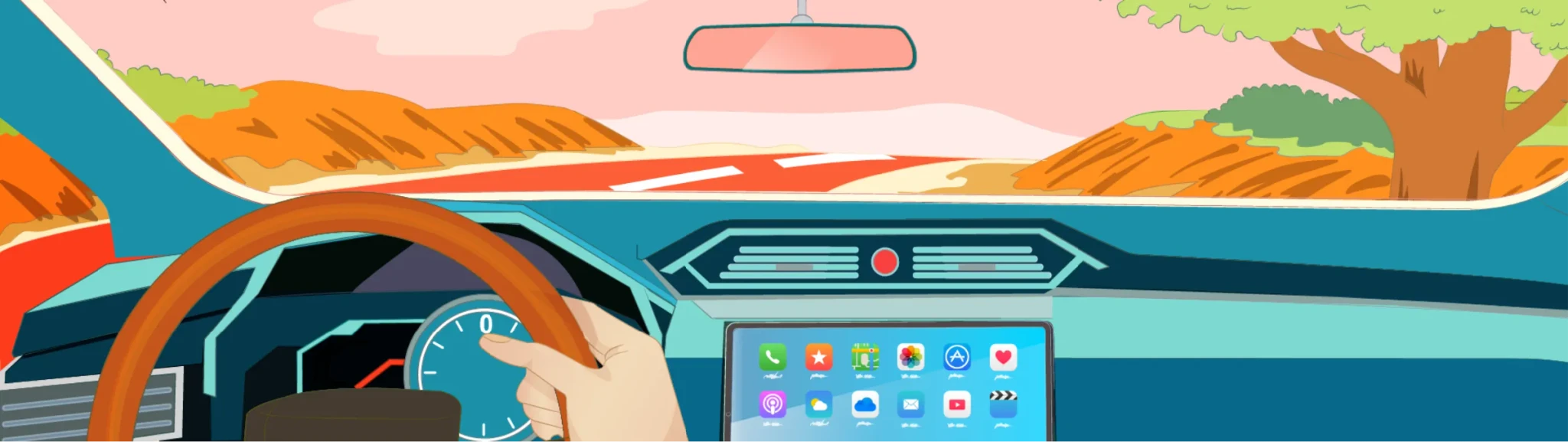
"He then thumbs-over to his podcast app and begins listening to commentary regarding the definition, structure, and functions of an IRB/IEC."
"He then thumbs-over to his podcast app and begins listening to commentary regarding the definition, structure, and functions of an IRB/IEC."
"He then thumbs-over to his podcast app and begins listening to commentary regarding IRB/IEC."
"During lunch, Henry reflects with satisfaction on becoming more familiar with ICH GCP"
"During lunch, Henry reflects with satisfaction on becoming more familiar with ICH GCP"
"During lunch, he reflects satisfaction on becoming familiar with ICH GCP"

Conclusion section banner from GCP Fundamentals
Conclusion section banner from GCP Fundamentals
Conclusion section banner from GCP Fundamentals
Diverse Scenarios with Common Atmosphere:
Although each course was set in a different real-life scenario, we helped convey a consistent, relaxed tone, reflecting a protagonist calmly engaging with GCP concepts in everyday moments like commuting or having coffee. To visually support this atmosphere, a distinctive accent color was asigned to each course while maintaining a unified system to ensure brand cohesion and narrative continuity.


Regardless of the setting in which they take place, the intention is to bring the reader and the protagonist closer together, through the use of everyday objects, close-ups, organic forms, warm colors, and transparencies.
Regardless of the setting in which they take place, the intention is to bring the reader and the protagonist closer together, through the use of everyday objects, close-ups, organic forms, warm colors, and transparencies.
Regardless of the setting in which they take place, the intention is to bring the reader and the protagonist closer together, through the use of everyday objects, close-ups, organic forms, warm colors, and transparencies.
Simplifying Complex Information
To support dense regulatory content, I developed a system of abstract, geometric illustrations designed to clarify complex concepts without relying on traditional icons. These visual elements were modular and interchangeable, including not only the illustrations themselves but also supporting background shapes and objects. This allowed for flexible composition across multiple courses while maintaining consistency and enabling quick adaptation to new materials as the design system evolved. It also contributed to balancing information density with visual breathing room.

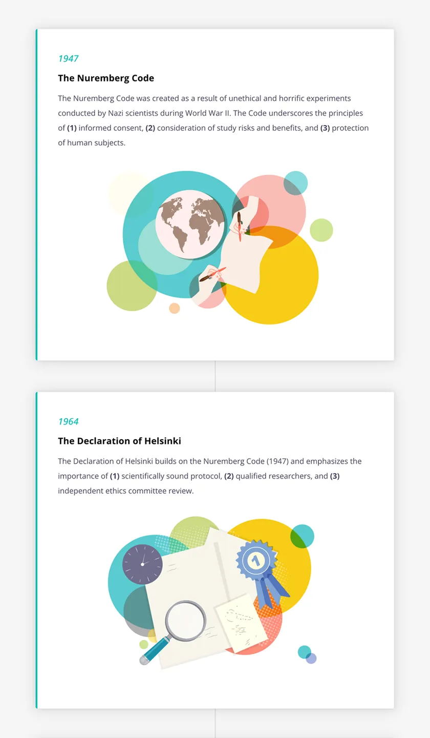
The Nuremberg Code representation
The Nuremberg Code representation
The Nuremberg Code representation

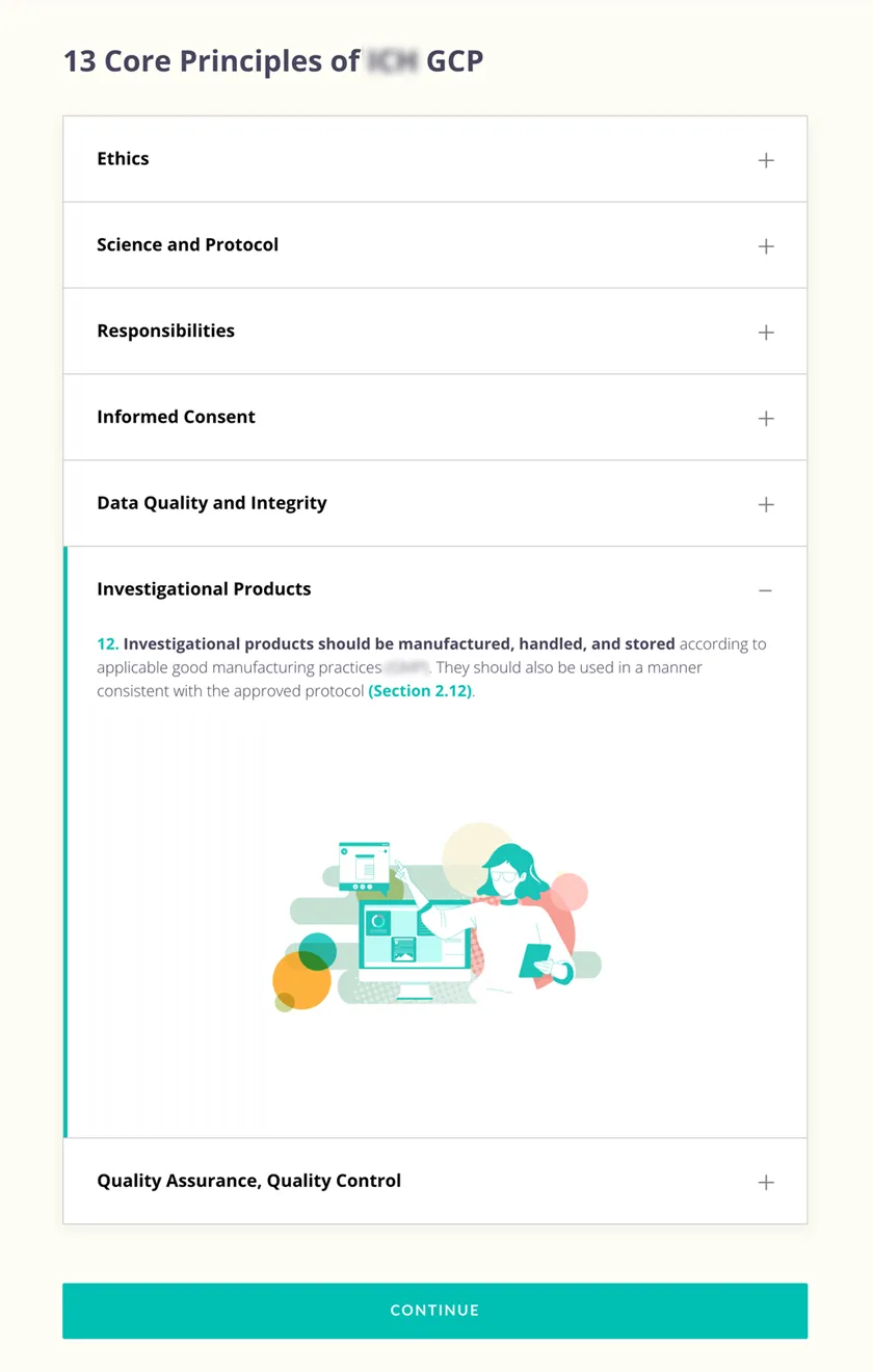
Quality Assurance, Quality Control
Quality Assurance, Quality Control
Quality Assurance, Quality Control

Responsibilities representation
Responsibilities representation
Responsibilities representation
Graphic style
The visual direction aimed to evolve IQVIA’s e-learning branding to resonate with a global audience, particularly in China and Japan. Conducting trend research in both Asian and Western markets, I drew inspiration from illustrators like Victo Ngai and Sachin Teng, who blend American and Chinese aesthetics. This led to a hybrid style combining elements of American comics and Japanese animation, simple enough for scalability, yet distinctive and relatable across cultures.

Accent colors
Organic shapes (derived from IQVIA’s corporate branding)
Closed curves
Transparencies
Warm color palette
Modulated color outlines
Accent colors
Organic shapes (derived from IQVIA’s corporate branding)
Closed curves
Transparencies
Warm color palette
Modulated color outlines
Graphic style developed combining modulated outlines, organic branding elements, and a hybrid East-West illustration approach.R
Visual System Palette
Font Color
Font Color
#49475E
R 73 G 71 B 94
Background 1
Bg 1
#FDF8F8
R 253 G 248 B 248
Background 2
Bg2
#F5F5F5
R 245 G 245 B 245
Background 3
Bg 3
#F6F2EF
R 246 G 242 B 239
Background 4
Bg 4
#FFFFF6
R 255 G 255 B 246
Background 5
Bg 5
#FDFDF5
R 253 G 253 B 245
Illustrations Global Colors
Green 800
Green 800
#246E27
Green 600
Green 600
#6D9E3F
Green 400
Green 400
#A9BF30
Green 200
Green 200
#B1D451
Green 100
Green 100
#E3EBB7
Brown 800
Brown 800
#572B11
Brown 600
Brown 600
#C4561C
Brown 400
Brown 400
#D18432
Brown 200
Brown 200
#F59C44
Brown 100
Brown 100
#E9DBCE
Blue 800
Blue 800
#1B90A8
Blue 600
Blue 600
#12CDD4
Blue 400
Blue 400
#67CBCF
Blue 200
Blue 200
#7ED9D1
Blue 100
Blue 100
#BFF2EE
Purple 800
Purple 800
#49475E
Purple 600
Purple 600
#8197D4
Purple 400
Purple 400
#A0AFD9
Purple 200
Purple 200
#B1CAF0
Purple 100
Purple 100
#CED7E3
Red 800
Red 800
#FD3C1E
Red 600
Red 600
#FD715B
Red 400
Red 400
#F4867B
Red 200
Red 200
#FFA49C
Red 100
Red 100
#FFBBB5
Orange 800
Orange 800
#FF6F0F
Orange 600
Orange 600
#FF924A
Orange 400
Orange 400
#FFAC75
Orange 200
Orange 200
#FFD4B8
Orange 100
Orange 100
#FFEBDE
Yellow 800
Yellow 800
#FFD936
Yellow 600
Yellow 600
#FFE261
Yellow 400
Yellow 400
#FFED8A
Yellow 200
Yellow 200
#FFF5BD
Yellow 100
Yellow 100
#FFFADC
Courses Accent Colors
GCP Fundamentals
Fundamentals
#6CBCB2
R 108 G 188 B 178
Course W1-1
Course W1-1
#DB8C7F
R 219 G 140 B 127
Course W1-2
Course W1-2
#E79933
R 231 G 153 B 51
Course W2-1
Course W2-1
#FD715B
R 253 G 113 B 91
Course W2-2
Course W2-2
#559E5B
R 85 G 158 B 91
Each course was treated as a self-contained visual “universe” differentiated by a unique accent color, yet unified through a consistent design system.
Illustration and Icon Subsystem
To simplify abstract or technical concepts, I created a set of highly refined, geometric illustrations. This system avoided cognitive overload while reinforcing key messages, helping create a cohesive learning experience.
Illustration and Icon Subsystem
To simplify abstract or technical concepts, I created a set of highly refined, geometric illustrations. This system avoided cognitive overload while reinforcing key messages, helping create a cohesive learning experience.
Illustration and Icon Subsystem
To simplify abstract or technical concepts, I created a set of highly refined, geometric illustrations. This system avoided cognitive overload while reinforcing key messages, helping create a cohesive learning experience.

Accent colors
Recognizable with minimal detail
Use of negative space
Minimal lines
Interchangeable backgrounds
Key features included: Use of negative space, subtle shadows, and minimal lines. High recognizability with minimal detail, Interchangeable backgrounds and objects for versatility across courses.
Rise interactive blocks using the icon subsystem to support the assimilation of complex information through clear, consistent visual cues
I also maintained visual continuity with a previously designed course, Introduction to Data Classifications, ensuring brand coherence across the broader learning ecosystem.
I also maintained visual continuity with a previously designed course, Introduction to Data Classifications, ensuring brand coherence across the broader learning ecosystem.
I also maintained visual continuity with a previously designed course, Introduction to Data Classifications, ensuring brand coherence across the broader learning ecosystem.
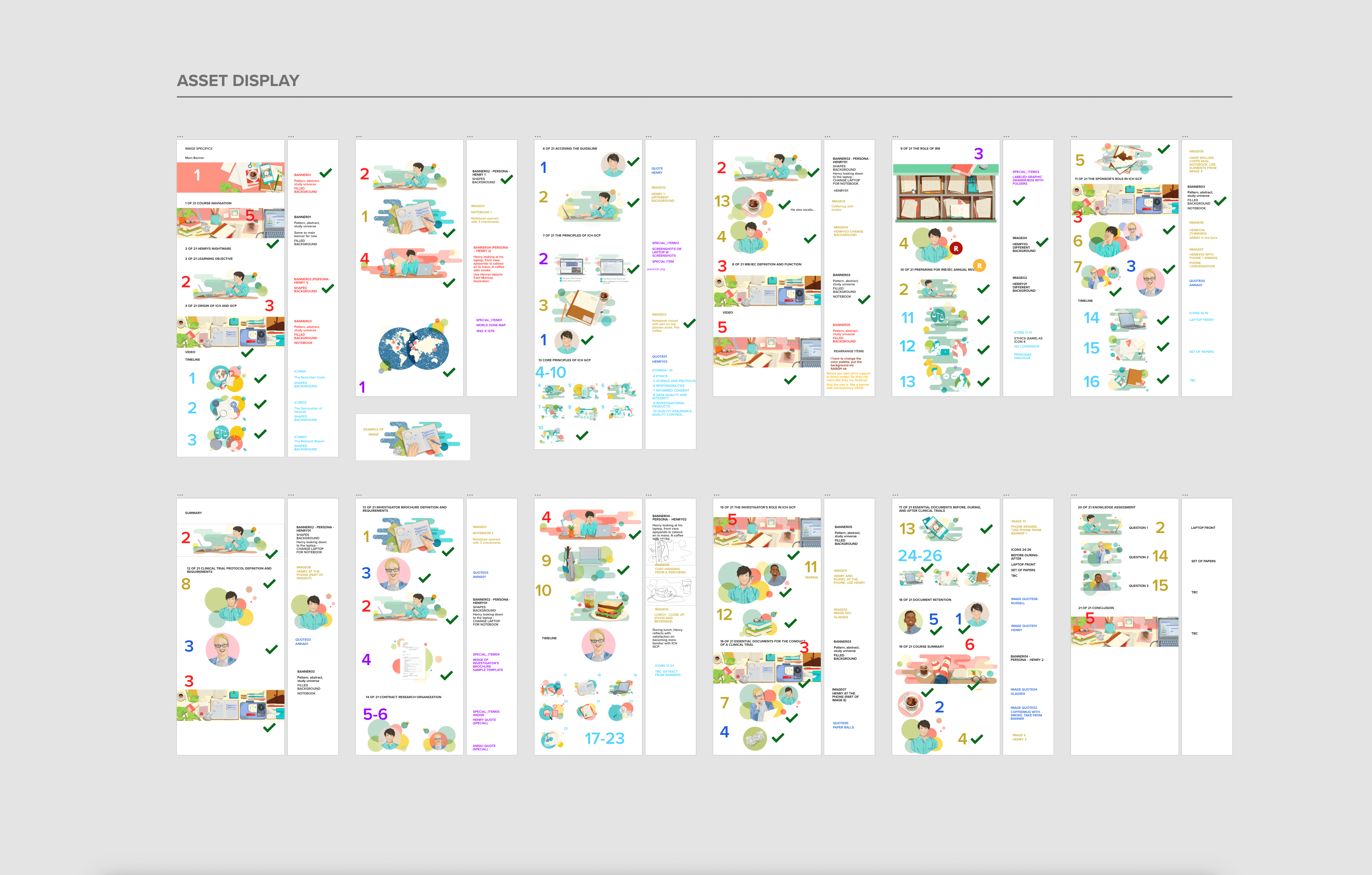
Workflow and tools
We used Rise 360, a block-based authoring tool that allowed for fast, visually cohesive course assembly. The courses were optimized for desktop in this first phase. Each course combined storytelling with technical content, structured around lesson objectives, narrative videos, detailed learning blocks, and assessments. I worked with Rise 360’s pre-made blocks, including: videos, banners, timelines, image/text blocks, maps, quizzes, flashcards, accordions, tables, and buttons. To support scalability, we designed five adaptable asset types that fit seamlessly into these categories:
Storytelling Banners: Full-width visuals with or without backgrounds, used to open lessons or introduce visual pauses.
Storytelling Images: Half-screen images showing characters or details.
Abstract Illustrations: visuals to clarify complex concepts across courses.
Quote Block Images: Circular images for quotes or emphasis blocks.
Special Items: custom visuals made for unique course needs.
Example of a special item category asset, custom-designed for key sections within specific courses.
Collaborative XD file with timeline, style guides, and asset assignments, used to organize and export all visuals for the e-learning platform.
Collaborative XD file with timeline, style guides, and asset assignments, used to organize and export all visuals for the e-learning platform.
Collaborative XD file with timeline, style guides, and asset assignments, used to organize and export all visuals for the e-learning platform.
The Outcome
A comprehensive design system created in just 45 days, launched alongside the first two courses and successfully applied to the remaining seven.
Over 210 original, vector-based illustrations and modular assets, designed for easy reuse and localization.
Clear visual guidelines and modular assets (icons, banners, multimedia components, character imagery, etc.), enabling consistent and efficient content production.
A visual identity that not only elevated the learning experience but also influenced the company’s corporate design language.
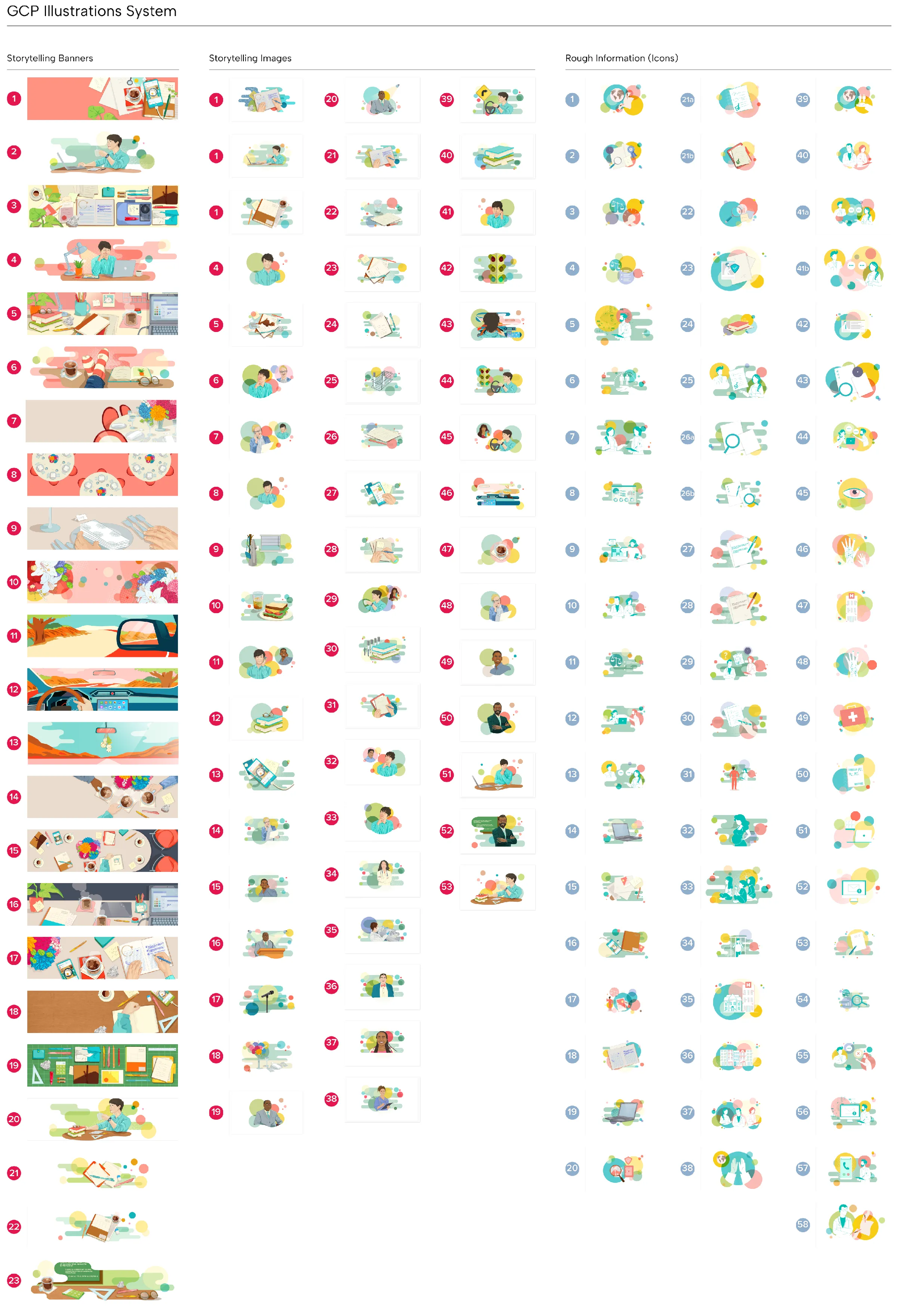
Over 210 original, vector-based illustrations and modular assets, designed for easy reuse and localization.
Over 210 original, vector-based illustrations and modular assets, designed for easy reuse and localization.
Over 210 original, vector-based illustrations and modular assets, designed for easy reuse and localization.
Conclusion
The IQVIA Good Clinical Practices E-Learning Design System demonstrates how thoughtful design can transform complex regulatory content into an engaging and culturally resonant learning experience. Developed under a tight three-month timeline, I delivered a scalable design system that ensured consistency across nine global courses, ultimately shaping visual standards that extended beyond this initiative and into broader corporate communications. This work required a multidisciplinary approach, combining branding, storytelling, and user experience to connect with learners across diverse linguistic and cultural contexts. From defining the visual universe to managing illustration workflows and overseeing creative consistency, the process balanced strategy with scalable production.