What I did
Audited and restructured the legacy UI kit
Defined and implemented all design tokens (color, spacing, radii, borders)
Built a library of reusable components
Created detailed in-Figma documentation for cross-functional teams
Anticipated developer needs and improved handoff workflows
As the sole designer on this initiative, I worked end-to-end across research, system architecture, visual standardization, and documentation. I designed the system with scale and collaboration in mind, creating a shared language between design, product, and engineering
Layout & Grid Styles
2- and 4-column options with 24px margins and 16px gutters
Documented 4 layout styles for different content types
Used these foundations to ensure alignment across mobile breakpoints
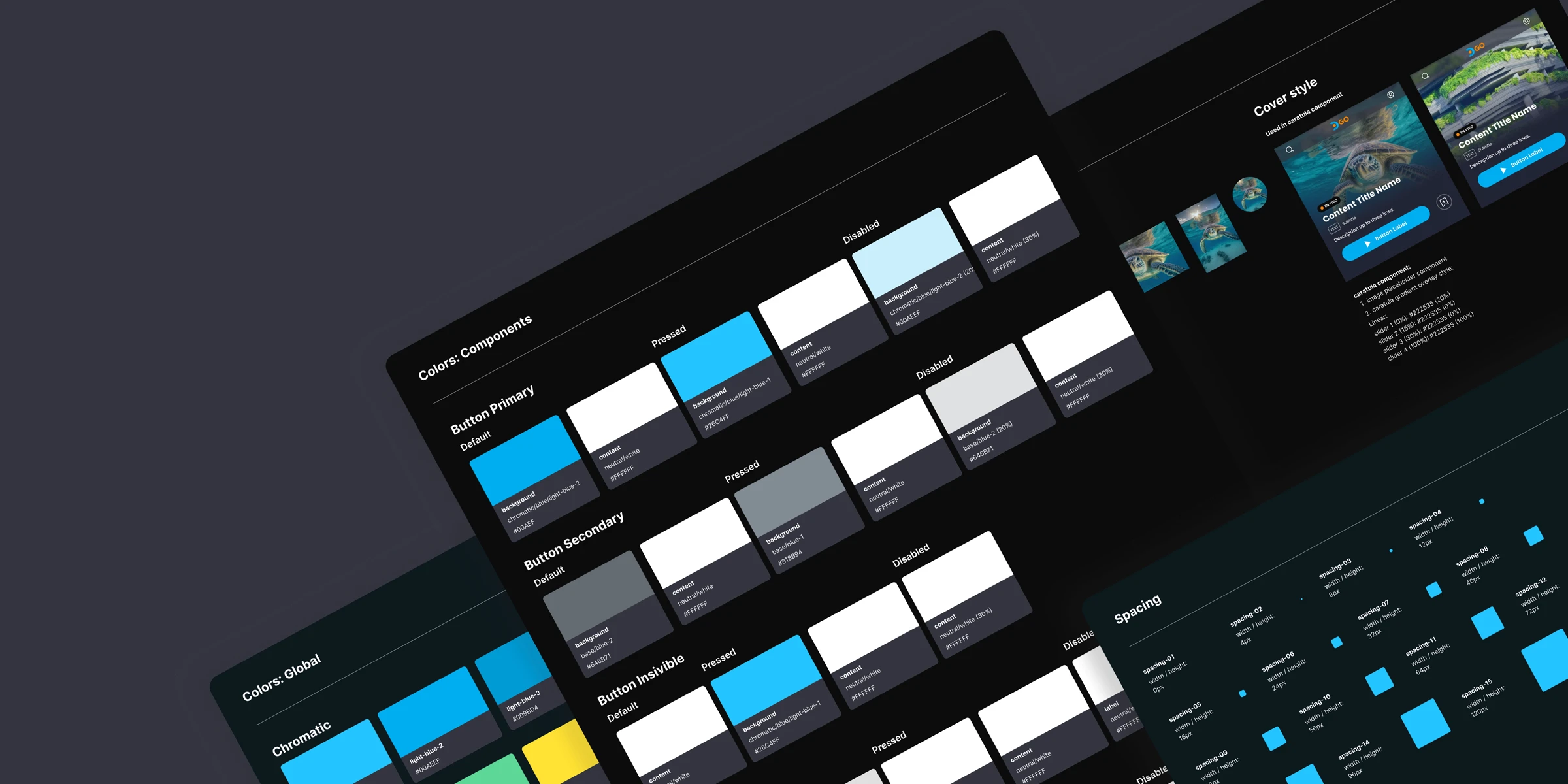
Spacing Tokens
spacing-00
width / height: 0px
spacing-01
width / height: 4px
spacing-02
width / height: 8px
spacing-03
width / height: 12px
spacing-04
width / height: 16px
spacing-05
width / height: 24px
spacing-06
width / height: 32px
spacing-07
width / height: 40px
spacing-08
width / height: 48px
spacing-09
width / height: 56px
spacing-10
width / height: 64px
spacing-11
width / height: 72px
spacing-12
width / height: 80px
spacing-13
width / height: 96px
spacing-14
width / height: 120px
spacing-15
width / height: 160px
Built on an 8px and 4px base grid
Used across components for consistent padding, margin, and alignment
Colors
Chromatic
light-blue-1
#26C4FF
light-blue-2
#00AEEF
light-blue-3
#009BD4
light-blue-4
#005993
orange-1
#FFA514
orange-2
#FE8200
orange-3
#FF5B14
red
#FF3459
green
#5DD695
yellow
#FFE134
indigo
#3375FF
violet
#995DD6
Base
blue-1
#818B94
blue-2
#646B71
blue-3
#343640
blue-4
#282A39
blue-5
#222535
blue-6
#0D191E
Neutral
gray-1
#DFDFDF
gray-2
#AFAFAF
gray-3
#4F4F4F
gray-4
#2F2F2F
gray-5
#0C0C0C
white
#FFFFFF
black
#000000
Color Tokens
Created for Primary/Secondary, Backgrounds, Text, Borders, and States
Token Examples: Content
content-1
#DFDFDF
neutral/gray-1
content-2
#FFFFFF
neutral/white
content-3
#26C4FF
chromatic/blue/light-blue-1
content-4
#FE8200
chromatic/orange/orange-2
content-inverse
#0C0C0C
neutral/gray/5
Token Examples: Component Specific
Button Primary
button-primary-default-background
#00AEEF
chromatic/blue/light-blue-2
button-primary-default-content
#FFFFFF
neutral/white
button-primary-pressed-background
#26C4FF
chromatic/blue/light-blue-1
button-primary-pressed-content
#FFFFFF
neutral/white
button-primary-disabled-background
00AEEF
chromatic/blue/light-blue-2 (20%)
button-primary-disabled-content
#FFFFFF
neutral/white (30%)
Iconography Examples
Navigation
Controls
Operations
User
Icon Container
This component is responsible for loading icons from the iconography library in various sizes, while maintaining the defined padding and safe area guidelines.
Icon Sizes
16px, 20px, 24px, 32px, 40px, 48px
Icon States Uses
We generally use the outlined version of the icon as a default state, while using the filled version for active states.
Text Styles Basics: Poppins
h1
Poppins Bold 22/28
button 1
Poppins Semibold 14/20
h2
Poppins Semibold 18/24
button2
Poppins Semibold 16/24
h3
Poppins Semibold 12/20
button Navbar default
Poppins Medium 8/16
h4
Poppins Medium 10/16
button Navbar Active
Poppins Semibold 10/16
Text 1
Poppins Regular 12/20
badge 1
Poppins Semibold 9/12
Text 2
Poppins Medium 12/20
badge 2
Poppins Regular 8/12
Border Radii & Border Width Tokens
Border radius
radius-none
border-radius: 0px
radius-xs
border-radius: 4px
radius-sm
border-radius: 8px
radius-md
border-radius: 12px
radius-lg
border-radius: 16px
radius-xl
border-radius: 24px
radius-2xl
border-radius: 32px
radius-3xl
border-radius: 48px
Border width
border-thin
border-width: 1px
border-bold
border-width: 2px
7 levels of radius + 2 border width values
Applied across cards, buttons, inputs, and overlays
Fully tokenized for use in code
Elevations and effects
elevation-1
drop-shadow: (0, 2, 2, 0)
surface/overlay-2: #005993 10%
elevation-2
drop-shadow: (-2, 2, 2, 0)
surface/overlay-2: #005993 10%
elevation-3
drop-shadow: (0, -2, 2, 0)
surface/overlay-1: #00AEEF 5%
elevation-4
drop-shadow: (0, 2, 2, 0)
surface/overlay-1: #00AEEF 5%
elevation-blur
blur: 5,8px
Used for top bar
Defined 4 levels of elevation + 1 background blur style
Added visual hierarchy without overwhelming the user
Documented with visual examples and implementation rules
Image treatment
Basic style
All images should include a subtle blue overlay to ensure visual harmony with the platform’s color palette and maintain a cohesive, blended appearance across the UI.

Image placeholder
color: surface/overlay-1: #00AEEF (5%)
color: surface/overlay-2: #005993 (10%)
Cover style
For the cover component, images must include a specific gradient overlay to ensure clarity and visual consistency. The overlay uses a four-point linear gradient with the following stops:
0%:
blue-5at 20% opacity15%:
blue-5at 0% opacity30%:
blue-5at 0% opacity100%:
blue-5at 100% opacity
Logo treatment
logo colors:
branding/logo-orange
branding/logo-light-blue
branding-logo-gradient color style (linear):
0%: logo-light-blue
100%: logo-blue
Component Library
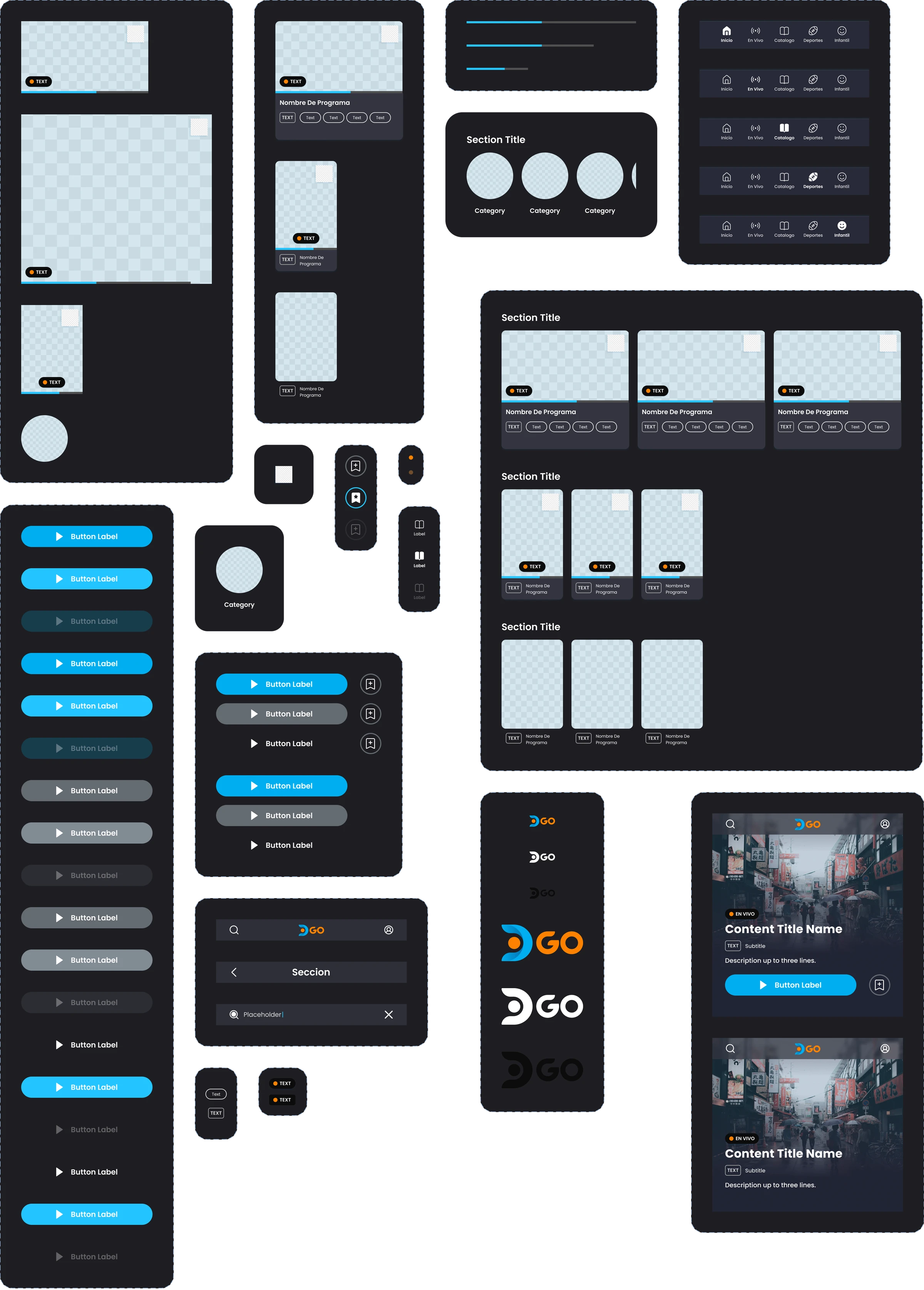
I consolidated and rebuilt over 30 UI components, including:
Buttons, tabs, cards, carousels, alerts, modals, input fields, and more
Documentation
Every component includes embedded documentation inside Figma:
Behaviour, overview and when to use.
Supported states and variants
Dos and Don’ts
Visual examples and annotations
Notes for developers (naming, tokens used, spacing rules)
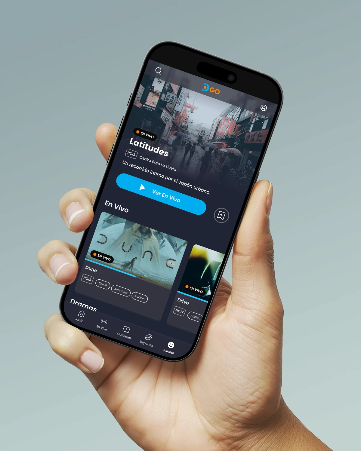
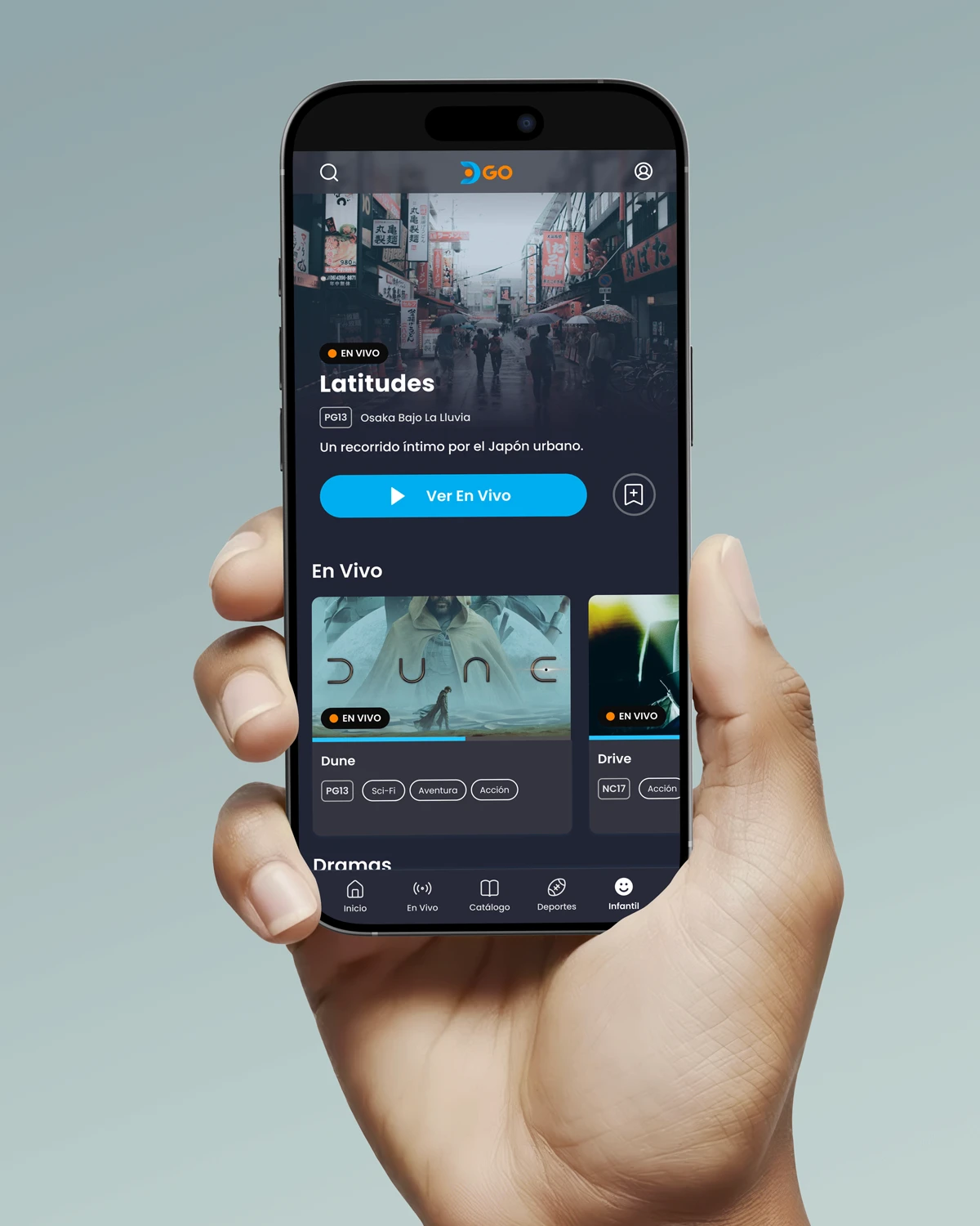
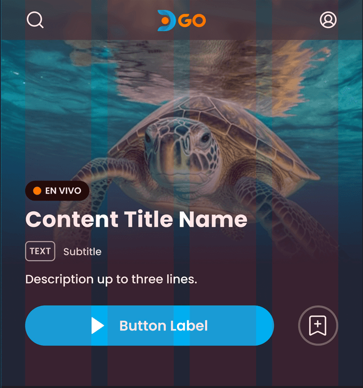
Top bar
Behaviour
The Top Bar component is a flexible navigation element typically located at the top of the screen. It consists of customizable buttons on both the left and right sides, and the product logo. The component includes a search field variant and a section variant, which provides additional context for user navigation.
Component overview
Default navbar
One icon right
Icon left only
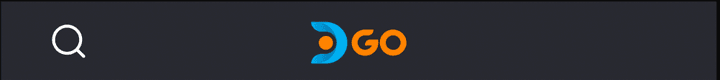
Active search variant

Displays a search field when activated, allowing users to search content directly from the top bar.
Section state
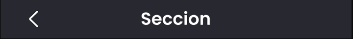
Displays the name of the section the user is currently in
Notes
-
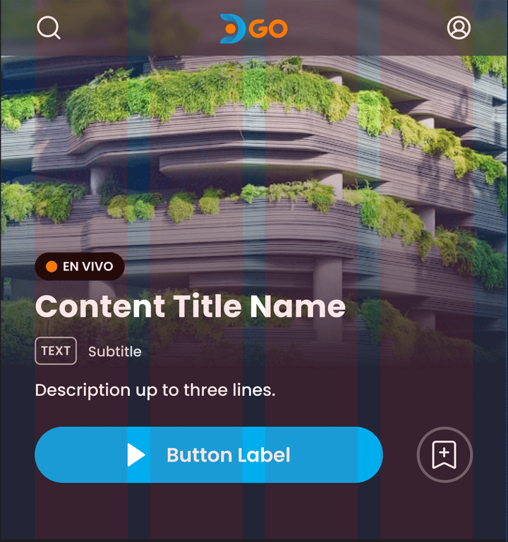
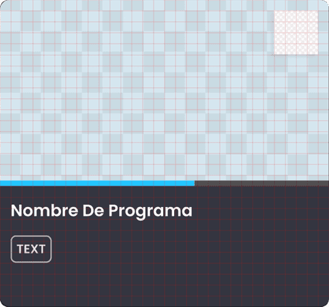
Content card
Behaviour
The Content Card is used to display existing content with various types of information. It presents key details about each show, such as the title, description, and additional metadata. The component offers three fully customizable variants: Full, Regular, and Compact, each designed to fit different layouts and content priorities.
Component overview
Full variant, multiple combinations available:

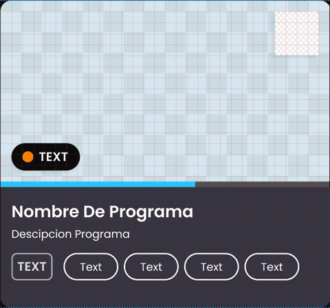

Regular
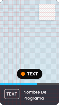
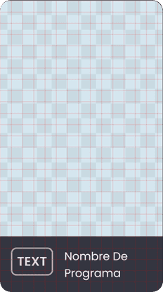
Displays essential information, such as the title and image, with optional brief metadata. It balances between information density and visual clarity.
Compact
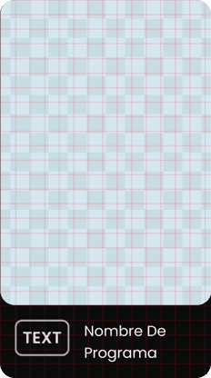
Displays only the most crucial details, like the title and content rate. This variant is used in categories section and does not include the progress bar or badges.
Notes
-
Deliverables
Visual foundations: Tokenized system for color, spacing, border radii, and effects.
Component library: 30+ reusable UI components with state and responsive variants.
Icon pack: Unified visual style and stroke weight.
Figma design system: Built with variables, styles, variants, and documentation-ready pages.
Guides and documentation: Annotated components, layout guides, dos/don’ts, and usage rules.